Tuesday, 30 November 2010

I.T.A.P Photography (last I.T.A.P lecture)

Key principles


  • How can you add text to change an image
  • How text can influence our emotions
In photography and image is just and image, without some text to explain what the image is portraying then we have no idea weather an apple is just an apple or if its ment to show us how the recession is harming our economy. For example such photographers such as "John Heartfield" and "Peter Kennard" it is obvious to see what there photography is ment to be showing us.


Avendons work in the american west
This was a book by"Laura wilson" one of "Richard avendons" assistants, now his work was not self explanatory and he only took black and white photos in this book. The book was about "drifters" and how he just took pictures of them, now this is all well and good but the people have no story to them, its really just a blank canvas now text could change this and give you a lot more information but he chose not to do this, and its a crying shame because in my opinion it really ruins these beautiful crisp black and white photos.


How can text influence our emotions

Now a photo of a murder scene is just a photo if we didn't know that the picture we were looking at was a murder scene, but put a bit of text underneath the picture explaining that manny innocent people died in that very spot would make you think a lot more about that photo. Well this is exactly what one photographer did, unfortunately i canot find any photos at this moment of his work. However i can tell you about photos take from the victims of the "Cambodian killing fields" this was when there was a lot of Communism in that area and anybody who failed to comply with the raceme were taken for "correction" by this they were horribly assaulted and then killed. These photos did have text in the book where it explained all this but without the text you would have thought that they were just drifters like the photos above. 

Sunday, 28 November 2010

Update on my skills sketchbook and life!

Well this new design is all about not being silent all your life i guess, and using that voice inside but some people find this very hard. As for the medium i havnt used every bit of watercolor in sight this time and ive actually used my very very very fine pens to make that red as colorful as possible. My next piece is all about not being complete before you die.

Life
On another note ive got a party coming up on saturday, hopefully this will be fun and the weed will be growing out of my ass!

Wednesday, 24 November 2010

Yes and its time for another update on my skills sketchbook.

This time ive decided to go for something a little more natural and base this design on the Eden project in cornwall, theres not really much to say about this one expect the amount of times ive drawn a hexagon in this piece almost drove me to destruction, but i got through it and finished it off with, yes some more water color using some pinks and purples this time. The thing that probably stands out the most in this piece is the colors used not only are they bright but leaving the actual structure itself with no color really made it pop and its one that im really happy to have done.

Tuesday, 23 November 2010

I.T.A.P Thought and structure in graphic art and illustration.

Principles

  • Over coming mindsets
  • Restating problems

Over coming mindsets
This is basically routine, where if you are used to working in a particular medium then you will continue to do so for a very long while, and even though your work may be magnificent you are not keeping your mind fresh and opening your self up to new ideas. These ideas could very well change the way you work forever and give you even greater success in this world as a designer. There are manny ways in keeping your mind fresh but i will name but a few that i use, the most important one is defiantly the environment that you work in, if you work in an environment that has no pictures or creative things in it you will not be able to find that inspiration you are looking for. This is a picture of my work space for example,
it might not be the biggest but it has everything i need plus the things i collect and pieces of either my work or artists i find interesting i stick on my wall. Another way of course is by looking at other artists work that have been in the same situation and find out how they overcome it by looking at their blogs.


Restating problems
As an artist you'l find yourself stuck at certain times, this could be because your not giving yourself enough options, enough room to play around as it were. They say whoever THEY are that any artist should have up to 50-70 different ideas about the design there working on, now personally i rarely have 20 so dont worry about having too manny ideas just try expanding the one you already have, or you could of course if your really stuck adapt another artists work to fit the criteria of your design such as, "Yuko shimizu's" work she took the idea of the great wave of kanagawa by "Hokusai" and just adapted it to make it her own.
However if you feel that this is plagiarism then you could just doodle like i do and this i feel helps me really get into what my subconscious mind is doing and allow my childish side to play.
 Take the notes that i was going in this lecture today, my notes are always like this and they might not look clear but to me they are but its the doodles that i did when i wasn't really paying attention that matters and i could easily turn into a pretty decent design if i kept working onto them.

This lecture has pretty much been on keeping your mind fresh and my one piece of advice i could offer is to always be creative maybe invest in a sketchbook that you just carry around with you and doodle in.

Wednesday, 17 November 2010

Another update in my "skills sketchbook" and my new love for watercolor.

As you've been noticing with the pieces ive been coming up with in my "skills sketchbook" alot of them have been involving watercolor, the reason for this is because it highlights what needs to be highlighted on that page but in a messy way which i love. Also you can get much more "grungy" colors from watercolor than you could with a flat color from a pencil crayon or colored  fine-liners, because the color is watered down a bit. It is a medium i would stress anyone to try using the same medium i use or even follows my heros in their work such as "Blu" or "John Burgerman"

Ah yes and now to see what ive been up to this week.

Here is my latest piece and it is as you can see based on "facebook", its basically about how people use this site especially your friends to prostitute all their personal problems, and how "pathetic" they make themselves look.

Sunday, 14 November 2010

Another update in my "skills sketchbook"

Yes its that time again for another look at what ive been up to this week in my skills sketchbook. This piece is a little more personal to me as it is a inside into what my love life is usually like. As always il put up the picture and il wait for any feedback, that is if anyone reads this thing, hahaha...im serious, i could write anything on here and i dont think it gets noticed by most of the outside world.

Also me and my group of friends at uni have just completed the sweded version of "The fly"
http://www.facebook.com/profile.php?id=1427826036
Okay theres the link to my facebook profile where it is currently residing but until i can get it onto my blog thats where youl have to go.
Until next time, stay sexy.

Wednesday, 10 November 2010

Update on my skills sketchbook.

The newest addition to my skills sketchbook, 
created using pen and watercolor.

Tuesday, 9 November 2010

I.T.A.P Lecture 6 (Production and Outcome)

Key principles
  • Medium
  • Testing    
 A medium is what tools you use to create a piece be it paint, pencil, pen ect, and also how you create it. choosing a certain medium can also be how you get yourself noticed in the world, many different artists use different mediums and communicate different things. Take "Banksys" work for example it focuses very much on "war" and "religion", where as the artist "Blu" dosnt focus on anything really but it is the way he works that makes up his medium, such as the lack of coulor that he dosnt use.This makes his pieces stand out a lot more than anybody else's also the sheer size of them dwarfs buildings.

Testing

Testing your work is crucial to how well it performs in the outside world, if you don't test your work how do you know if its communicating what you want it to? There are many ways you can "test" your work one of them is to upload it onto the internet and hope to revive comments and reviews of other people on it, another way is getting your work into a gallery. But the best thing to do is try and promote it as much as possible and in anyway shape or form this will show more people what you do and then you will get their comments on it in some way or another, but it is key that not only are you happy with the work that you produce but so are the clients and others.

Benefits of working on commercial and non commercial projects.

I think the benefits of not working on a commercial project is of course you can do what you wish because there is no client to tell you what you need to do, but on the other hand you don't get paid for it. In saying that and going back to what i was saying previously though it is a good way of getting your work out there as a client isn't going to use your work lets say in a shop window that's going to be an A4 poster which nobody is really going to see.

The benefits of working on a commercial project of course is that you do get paid for it, and not only that the client that you are working for can then pass your name on to another business and then that business might hire you.

Ah yes and before i forget i was going to upload the first piece that ive worked on in my "Skills" sketchbook.


Monday, 8 November 2010

Skills

So today i went and bought yet another sketchbook and almost straight away Ive started a design in it, which will be on flikr tomorrow, just click the large picture above and youl be able to see it as of tomorrow at some point. The reason why i went and bought another is so i can improve my skills as an illustrator, and what i mainly lack in is the ability to draw human like features, now this is a big issue because i cant keep drawing characters all of the time. One of my main heroes in the world of design is "blu"
A page from one of his sketchbooks.

You can see where my idea of using very little color comes from now, plus i love the way he uses very little detail but the lines make it seem like there is enough as well, and one day i aspire to be like this. But in the mean time practice makes perfect.

Sunday, 7 November 2010

The fly

At the moment im working in a group to swede the film the fly using stop frame animation, the deadline is this friday so i will upload the film as soon as i can. As for the week itself bonfire night was fun even if there was no actual bonfire.

Tuesday, 2 November 2010

I.T.A.P Lecture 5 (Moving image)


Key principles: Character and Narrative.

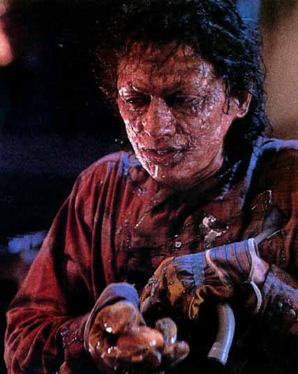
The characer is very important, he or she is the main part of the story they can either be a hero or a villain, the good guy doesn't always have to be the good guy. We call the main character the protagonist, there are many things that you must think of when designing a character, what do they look like? whats their personality like? how do they stand?, walk?, talk?, what is there body language? All these things come into play when creating somebody for a story. Lets take a film for example: "The fly" a very well known film, staring "Jeff Goldblum".
In the film he turns himself into part fly part human and in the end the fly's body consumes his and he just ends up becoming a 185 pound fly, but its the character itself that is interesting in this case because he is neither good or bad but both because he starts of as this scientist working on a way of treleportation, but he becomes to self obsessed in his work and ends up becoming the bad guy, a sort of "jackel and hide" moment. Note also how the character takes a phyical metormophasis and slowly gets more ugly and evil looking.

Narrative
Now this gives the story structure, a way in which to flow if you will, such as a beginning a middle and an end. Without this we would be lost such as with the film "the fly", there is a mad scientist he meets a woman, woman falls in the love with the scientist, scientist wants to impress woman so he trys out one of his inventions on himself, test goes wrong , scientist starts to turn into a fly, woman runs away from scientist, she realizes what she has done wrong and goes back to try and save him realizes it is to late and kills scientist. that is the narrative and it structures the whole film so it can make sense to you and me. Of course everything doesn't happen like that or the film would be boring but it does happen even if we don't realize it

And heres a famous quote for you "Every story needs a begging a middle and an end, but not in that order.

Monday, 1 November 2010

London ect...

So ive just come back from london, ive had an amazing time and also alot of time to collect all the crap that gets handed to you in the street and of take alot of pictures for my scrap book. There is just one thing that il not only take away from london by it will stick with me for my whole life and that is an impulse tattoo to add to my collection :P its a "stick giraffe breathing fire" dont worry there will be pictures of it, and if that wasnt good enough i had to rope my friend into getting one as well so no they can fight to the death! London helped me understand a lot and now i have everything i need to continue....

Oh and there will be pictures of my scrap book up soon.