


"Shikira" Tree time tales.

At the moment im currently doing a summer project where i have to illustrate two articals from any newspaper. I think i may have found my place doing edertorial illustration...


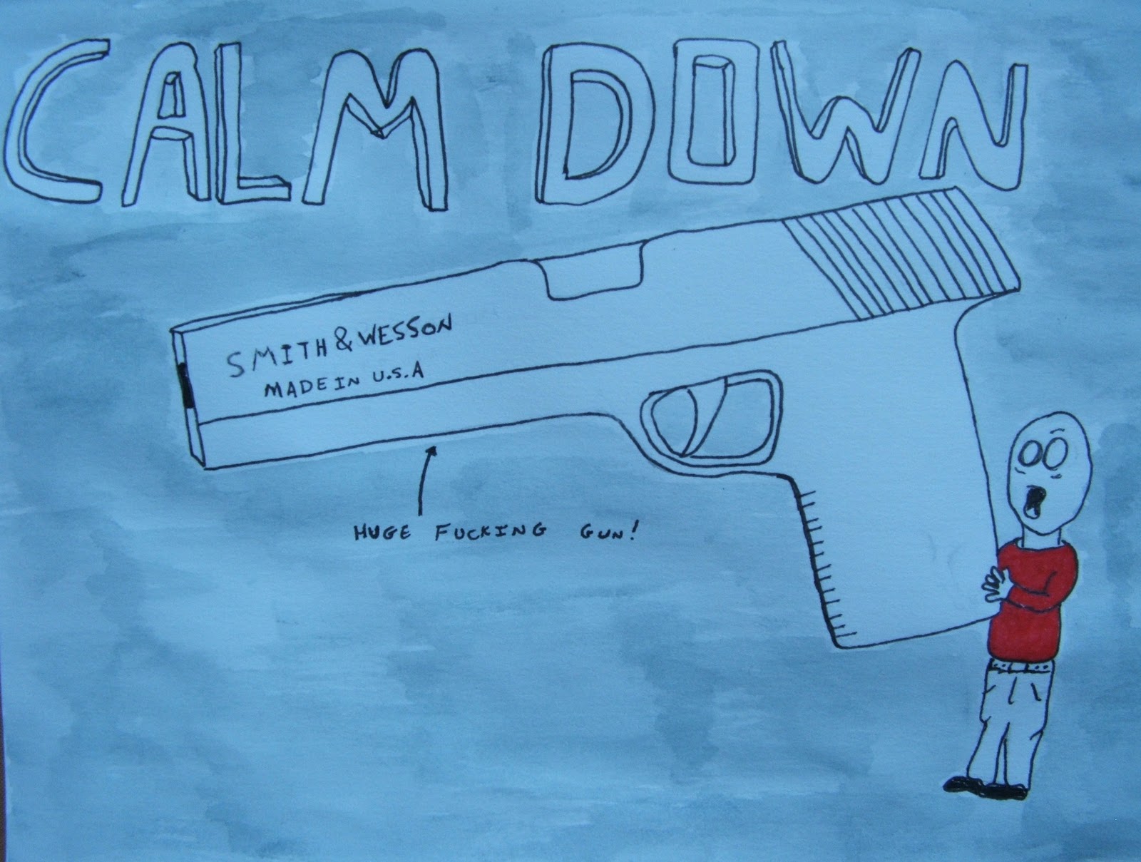 Yes its another update on my skills sketchbook, lately ive been swamped with uni work so i havnt had much chance to do some designs in my own time but just before i thought id be able to have time to do one another project from uni arives, so once again im swamped and more than usual this time because ive got to create an artist book, which is kinda what my skills sketchbook is but it dosnt really relate to birmingham so i doubt il be able to use it. Anyway recently ive been looking at "David Shrigleys" work if your not familiar with it il put a link in at the bottom, but if you are youl know that his work is alot of badly drawn line drawings, but the thing that i love about it is the fact that his work is so funny, this i thought would be an amazing chance to learn something from his work so, here we have my latest piece called "Calm down".
 I was asked to choose 5 words that i feel describe Birmingham and then just to pick one and create a piece about it, using type but not just any type my own typeface. After using acrylic copolymer on a sheet of perspex and stenciling out my typeface i then wanted to somehow bring light and shadow into this project, so i chose the words "only at night" because i feel that Birmingham's dark side really comes out at night and also this gave me a chance to bring my "grungy" way of working into it. So i began to set up lights and suspended my perspex from some invisible thread to make my photos look even more interesting when i took them. After a bit of editing in photoshop to make it look like id taken the photos in a subway at night my final piece was ready.


 This was a book by"Laura wilson" one of "Richard avendons" assistants, now his work was not self explanatory and he only took black and white photos in this book. The book was about "drifters" and how he just took pictures of them, now this is all well and good but the people have no story to them, its really just a blank canvas now text could change this and give you a lot more information but he chose not to do this, and its a crying shame because in my opinion it really ruins these beautiful crisp black and white photos.
 Now a photo of a murder scene is just a photo if we didn't know that the picture we were looking at was a murder scene, but put a bit of text underneath the picture explaining that manny innocent people died in that very spot would make you think a lot more about that photo. Well this is exactly what one photographer did, unfortunately i canot find any photos at this moment of his work. However i can tell you about photos take from the victims of the "Cambodian killing fields" this was when there was a lot of Communism in that area and anybody who failed to comply with the raceme were taken for "correction" by this they were horribly assaulted and then killed. These photos did have text in the book where it explained all this but without the text you would have thought that they were just drifters like the photos above.